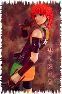
Character: Hinoe
Series: Harukanaru Toki No Naka De 3
Sculptor: Asada Saki
Scale: 1/10
Manufacturer: Kotobukiya
Release Date: January 2010
Run: Standard
I noticed something today as I was looking back through “Somewhere”, we are clearly lacking in bishonen. There are plenty of fine looking men gracing the blog, but it seems that with the new trends of anime we have been given a plethora of average looking guys, and very little in the form of pretty boys. The last one that I turned out here was over half a year ago. This being said I thought it was time to bring out one of my personal favourites. You may remember him from my recent Harukanaru cushion review. His name is Hinoe, and he is everything I want in my bishonen.
Hinoe is just barely seven inches tall, but Kotobukiya didn’t waste a single centimeter. He has quite a bit of detail, not that I would expect any less from them. Lets take a closer look, and see what we find.
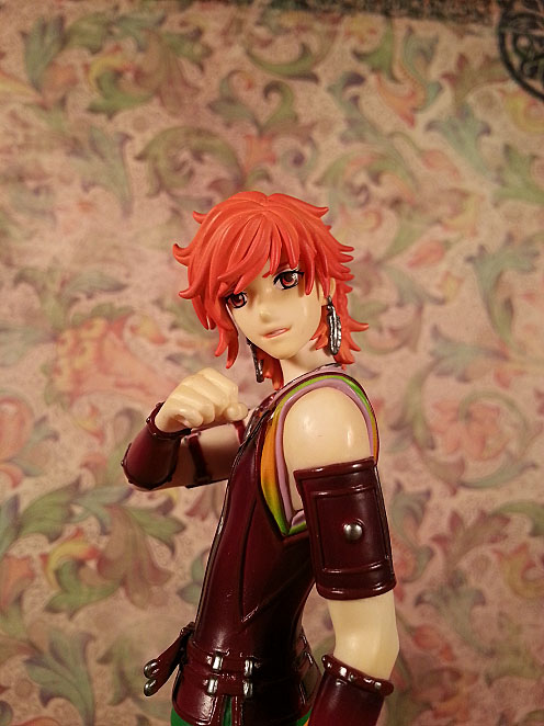
When first looking over Kotobukiya’s set of eight Haruka guys, Hinoe did little to stand out. He didn’t have a super build, nor did he have long cool looking hair. It wasn’t until I had him that I really started to appreciate the finer details. What really drew me to him though ended up being his wavy red locks. Hinoe’s swoopy bangs are detailed nicely. I really like the way it is longer on the side on which it is all brushed to. His hair is wispy, and full of body. Koto also did a fantastic job on the shading. The ends of his hair are a darker orange, which tapers to a lighter shade near his roots.
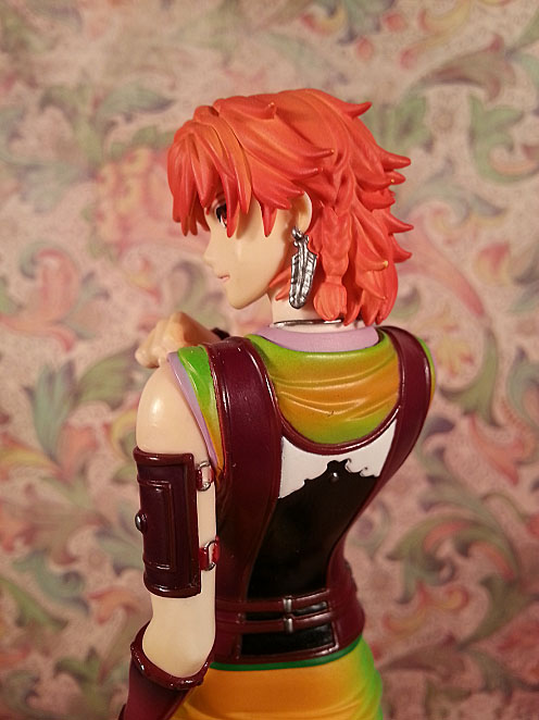
Hinoe wears the hair behind his left hair in a nice little braid. It is probably just me, but I think this is kind of sexy. It is sculpted very well, but I wish the fellows at Koto would have painted the hair tie. The seamline between his bangs and the back of his hair is perfectly hidden. From the side we get a really great view of his feather earrings. They come off a bit chunky on the figure, but Koto did an admirable job getting as much detail on there as possible. There is even a tiny hoop through his earlobe. The tips of his hair show some paint chipping, unfortunately that is caused by own negligence.

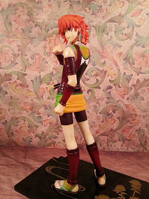
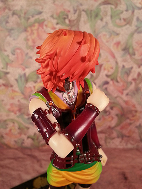
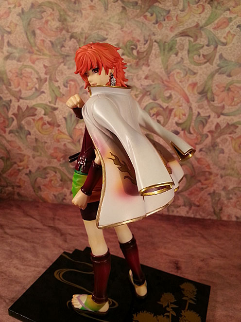
The back of his hair is pretty unruly. There are little wisps going every which way, but it looks really good. The shading on the back is pretty fantastic as well.
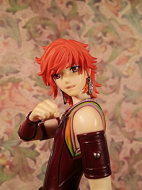
He has really pretty red and yellow eyes. They did a great picking, and mixing the colours together. The application of his eyes, and eyebrows was done well. They are symmetrical and line up with the sculpting perfectly. He has a defined nose, and a great mouth. It open just a bit, and you can see his teeth. I think he looks kind of happy, and maybe just a bit confident.
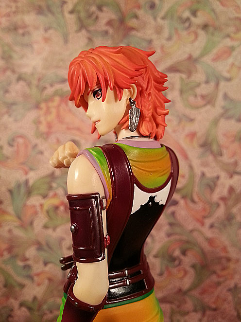
I love his profile too. I am so tired of figures missing the bride of their nose, and their upper lip in favour of a little pointy pimple of a nose just above their mouth. I have never seen a human being who was shaped that way. I understand I am talking about an anime character, but in 3D that just looks dumb. Anyway I often display this figure looking back over his shoulder, because his face is lovely and I adore his profile.
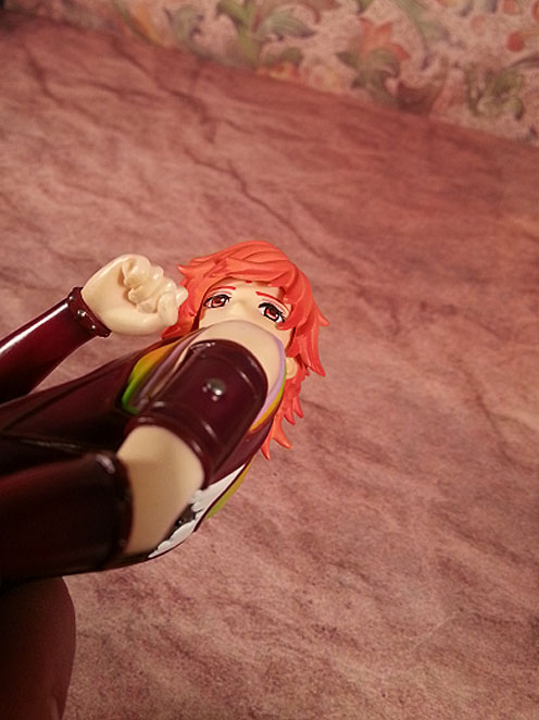
I know this is kind of a strange picture, but it was harder then hell to get on camera. Each of the eight sacred guardians has a tiny bauble of their character colour somewhere on their body. Hinoe’s just happens to be red, and hiding beneath his swoopy bangs. I thought it was pretty cool that they even put it under there.

Hinoe’s outfit looks kind of complicated. He is wearing at least three layers of clothing here. The bottom layer of his tunic is a light purple, almost lavender colour. It is also mostly visible around his neck. The second layer looks like it is tie died orange and green. The gradient looks really nice. The colours are vibrant, and definitely go well with his overall design. This part looks like a short kimono that he has pulled up into the leather vest. Notice the seam on his hip? Not pretty Koto. The folds in the fabric here look really good regardless of that silly seamline.
From the right angle you can see Hinoe’s rather elaborate necklace. This thing is a rather large series of interlocked rings. They did a pretty good job of recreating it. The torc like necklace can even be seen under hair in the back. I am pretty sure he can’t take that off either…
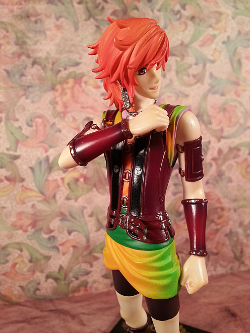
The leather armour is another one of my favorite parts. It is held closed in the front by a series of rings, and straps near the bottom. Each of the three rings looks as though it is actually connected to the vest. The two belt-like straps at his waist circle the entire way around, passing through several silver belt loops along the way. They close with buckles in the front. Hinoe wears them on the third hole. The paint might be a bit sloppy on them, but you can clearly see the unused holes. There is also a metal piece on the end of each strap. I also really like the way the excess bit of strap hangs loose. I know this a lot of talking about something simple, but it is pretty cool detailing. The last bit on the front of the vest is the tiny mon over each side of his chest. I personally know little about these symbols, but I found an interesting tidbit here. I found it interesting that a chose a water mon for a naval officer whose innate element is fire….Don’t ask me. It looks cool. He is also wearing a wide dark green belt. Another great colour added in.

The back of his armour looks fantastic. I love the white pattern along the top, accented by a tiny silver stud between his shoulder blades. I think one of the reasons that Hinoe stands out to me in the line of bishonen is his slender frame. The form fitting armour does a fantastic job showing off the curve of his back, and his slim waist. The neckline is cut low in both the back and front, showing a bit more of their wonderful painting. The folds in the fabric clearly show that the garment is bunched up a bit by the vest.
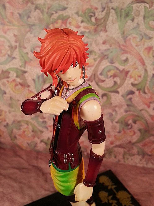
Hinoe really pulls off the leather armour well. He wears arm guards and bracers that match the vest. I love the colour they went with for these pieces. The red is such a rich shade. It is an amazing contrast to his bright choice of shirts. The armour pieces on his upper arms both have two straps that encircle his respective limbs. Again there is a silver ring at each end of the strap. We also get to see another silver stud in the center of each piece. Also note the paint transfer on his left shoulder. That is from the optional jacket. More on that to come. On his forearms, Hinoe wears bracers. I have always liked these, but that might just be the D&D geek in me. I do not know how he puts these on, as there are no visible buckles, straps, or seams. There are a series of studs around each wrist and elbow though. It looks really nice, even if not particularly functional.
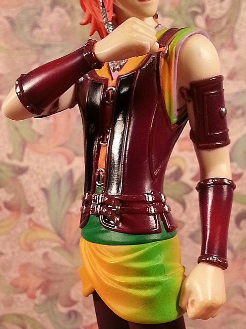
His hands are both fisted to give the appearance that he is actually holding his weapons. There is proper definition between his fingers, and his knuckles look good. Even though you can’t see them without close inspection, his fingernails are all sculpted too. You can see that his index finger curls around a small hole in his hand. There is one on each side, two on each hand. These are meant to filled by the weapons that snap into place. You can also see here a bit of red paint transfer. I was pretty upset by this. Here at least it is hard to see, but the paint on his shoulder really bugs me.

Hinoe’s legs are thin, long, and defined pretty well. His tight dark purple shorts have a slight edge at the bottom of them, shirking off the impression that they are flatly painted on. I was happy to see this is not the case. His knees are sculpted nicely, and I really like his calves. Again he is wearing a bit of matching armour; shin guards. No silver studs this time, but we do get two more buckles on each leg. Now here is the only part of his ensemble that I really question. He is wearing peach and orange striped socks under the shin guards. I can follow the socks. I am sure that would prevent chafing, but the colours!? Why?
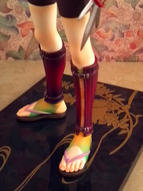
Then at his feet they go back to the green, and orange stirrups. You can totally tell I grew up in the 80’s, I know what stirrups are…. His footwear consists of simple sandals with a lavender thong. This is the only other point this shade shows back up on him. For whatever reason Koto decided to some weirdo shading on his toes. It looks odd, and even odder is the fact that they did not do it on his fingers. Other than that though, they look good. The sculpt is decent. The only other male figure that I can think of on my shelf with exposed feet is Natsume, and his feet look awkward and small. I am glad that Hinoe’s feet don’t look flat and girly.
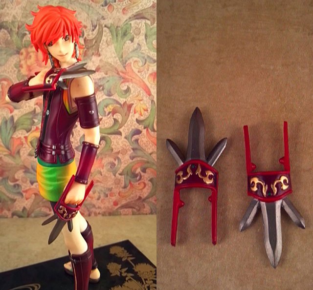
He fights with a two handed style using his weapons of choice, a pair of punching daggers. Each one has a small bump on the inside that fits into his hand. They fit in tight, which makes me really hate taking them out, but I guess they won’t get lost that way. It does make for icky paint transfer. The gold design on top is painted nicely, and I like the little green gem. Overall they look really nice, but feel very delicate.

The other optional part that Hinoe comes with is his coat. I hate this part. A LOT! It looks nice. It sits on his shoulders well. The sculpt is good. Look at the billowy effect. the pretty array of colours look alright, so what is the problem. Well it ruined my figure. I displayed him for a looong time wearing the jacket, then one day I took it off and there was a huge red mark on his shoulder. The dreaded paint transfer. It is gone now. I took a white eraser to him and got it off, but now there is a paler spot on his arm. It looks better than the red, but seriously. Anyway, the coat looks great, but if you have this figure use it at your own risk!
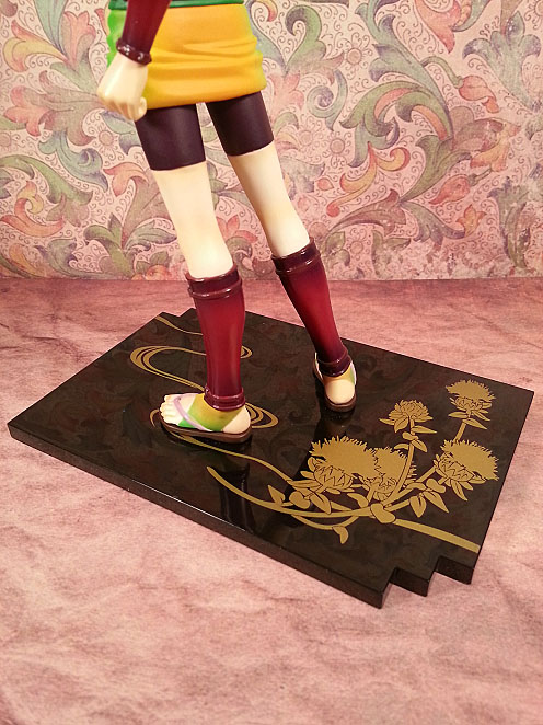
His base is a bit different, or at least unique to this series. All eight of these Haruka boys have the same basic base design. They do all have a different flower representing theirs. I have no idea what flower Hinoe has, but the black shiny base with the elegant floral design looks very Japanese. I love it.
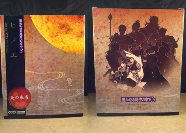
Lastly we come to his box. Remember when I said the didn’t waste any space as far as details go, well I should have included the box in that. Hinoe’s packaging is fabulous, and I mean it! The front has a gorgeous moon motif, and some elegant text, but no window. The rear of the box has silhouettes of all eight characters, with the feature one highlighted.
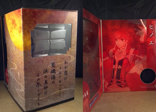
If you turn the box to the side you can see the base has its own little window. I thought that was really cute. The other side shares the same colour design as the front. You may be wondering where the front window is, well behind the magnetized flap of course. This box is simply wonderful. When you open up the flap not only do you get to see the figure, but also a huge artwork of the character.
Pros:
This figure is very detailed.
He has a vibrant palette.
He perfects the dead art of being a bishonen.
He looks pretty awesome from several angles.
His base is very pretty.
His box is gorgeous.
Cons:
His weapons feel very fragile.
He is a victim of really bad paint transfer.
Overall Enjoyment: 8/10


![MLP Equestria Girls: Rollercoaster of Friendship Review [Spoilers]](https://i0.wp.com/somewhereinthemidstofnowhere.wordpress.com/wp-content/uploads/2018/07/friends-forever.png?resize=200%2C200&ssl=1)